A daily miasma of frivolity by two wanna-be cultural critics. Or: just, like, some good links, dude.

Tag Archives: chicago (font)

Chicago detected – Change is in the Air (American Airlines commercial)

I’d like to apologize to our readers for having gone more than a year without an update in our award-winning series cataloging uses of the typeface Chicago in the wild.

I’m pleased to announce that you have to wait no further, because we’ve once again detected Chicago: this time in a television commercial for American Airlines. The word “DINER” on the window visible at the very beginning of the ad is set in this illustrious typeface.

Tagged ,

More Chicago detected, this time at a convenience store in Somerville, MA. Thanks to NS reader Paul Calnan.

Tagged

Chicago detected: the logo of La-La Land Records, a publisher of film, TV, and video game soundtracks.

Why would you vertically stretch it though stop that

Tagged ,

There was an odd Lynyrd Skynyrd confluence in recent strips of Sherman’s Lagoon (8/24, published online on 8/31) and B.C. (9/1).

Incidentally, Chicago detected in the title and byline of the online version of Sherman’s Lagoon.

Tagged , ,

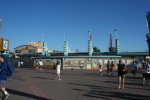
This is a followup to a previous post I made in the “Chicago detected” series. The concept art for the redesign of the entryway used Chicago as the font for the “California Adventure” sign above the entrance.

However, as you can kind of see in this photo taken by Doug Marsh for LaughingPlace.com, they went with a different font for the real thing. A thinner font. One could say a flimsier font. Where that one person is me. Chicago could beat up that font any day of the week.

Tagged ,

Chicago detected: the end credits of the PlayStation game OverBlood, originally released in Japan in 1996. It’s an early survival horror game. It’s also one of the games that Akihiro Hino worked on early in his career, before he founded Level-5.

I haven’t the faintest idea why this random PlayStation game uses Chicago for non-name text in the end credits, but it’s awesome that it does.

Tagged ,

Chicago detected: concept art for Disney California Adventure’s entryway redesign. I’m not sure when this specific piece of art was first released, but plans for the park’s major overall renovations and expansions were announced in 2007.

Work began on the entrance on January 4 of this year and is expected to take sixteen months. The Los Angeles Times ran a story on the entryway renovation in December 2010.

Tagged ,

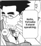
Chicago detected: Yotsuba&! chapter #59, as translated by Yen Press (page 94 in volume 9, published in 2010).

What is Chicago? Only one of the greatest fonts ever designed. Created by Susan Kare in 1983, it was the first font designed for the Macintosh, and it was a key part of the Mac interface through use in menus, window titles, and so on. Charcoal replaced it as the default system font in Mac OS 8, but it found later use as the first iPod interface font. It sadly no longer ships with Mac OS as a standalone font, but it can be substituted with the Thai font Krungthep, which uses Chicago’s letterforms for non-Thai characters.

Tagged ,