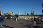
This is a followup to a previous post I made in the “Chicago detected” series. The concept art for the redesign of the entryway used Chicago as the font for the “California Adventure” sign above the entrance.
However, as you can kind of see in this photo taken by Doug Marsh for LaughingPlace.com, they went with a different font for the real thing. A thinner font. One could say a flimsier font. Where that one person is me. Chicago could beat up that font any day of the week.
